UI/UX design trends 2026: what top product designers are actually switching to
 Muhammad Babar· UI/UX Designer
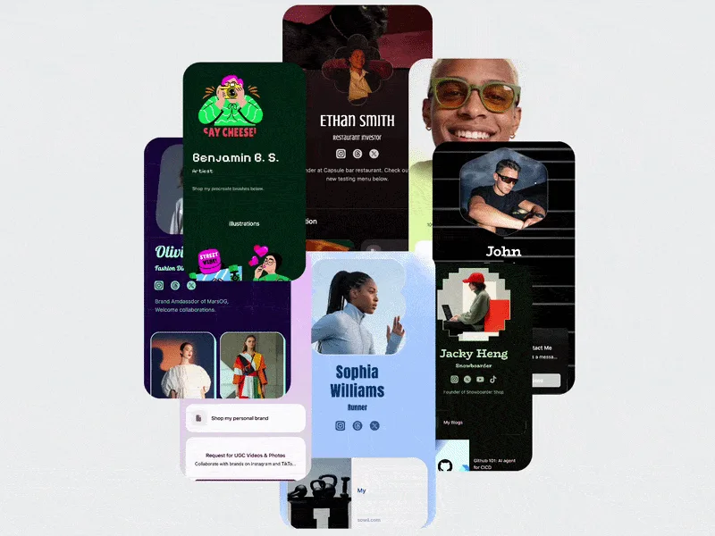
We’re past the halfway mark of 2026, and product design already looks different from how it did in January. The visuals have become more cinematic. The process has become more AI-assisted. And clients have noticed, because their briefs are starting to ask for both.
I’ve spent eight years designing fintech, SaaS and B2B products across more than 300 projects. My job is to tell a real shift from a Dribbble fad. Below are the UI/UX trends my team and I are actually putting into client work this year. For each one I’ve added a note on when it helps and when it gets in the way.
1. Cinematic 3D carousels
The flat, swipe-left image slider is being replaced by carousels with depth. Cards rotate in 3D perspective, sit on a curved track, and move with the easing you’d expect from a film title sequence. It’s showing up most in hero sections and product showcases, where the first few seconds decide whether a visitor keeps scrolling.
Why it works: Depth creates hierarchy without extra words. The active card sits in front, the next ones recede, and the eye knows where to look. For a product with several features or case studies, one well-built 3D carousel can replace three static sections.
Where it goes wrong: Heavy WebGL scenes on a landing page that has to load fast on mid-range Android phones. Always build a lightweight fallback, and respect prefers-reduced-motion.
2. Interactive cards that react to scroll and hover
The carousel has a close relative: cards that respond to you. They tilt toward the cursor, fan out as you scroll, or reveal a second layer of detail on hover. The interface stops feeling like a document and starts feeling like an object.
How I use it: Portfolio grids, pricing tiers, and feature comparisons all benefit from this. A small tilt or lift on hover tells users “this is clickable” more clearly than a colour change does.
The rule: The motion should explain something. If you removed the animation and the user would lose information about state, focus, or hierarchy, keep it. If they wouldn’t notice, it’s decoration, and decoration costs performance.
3. Kinetic, oversized typography
Type is doing more of the storytelling. Headlines scale with scroll, words reveal line by line, and display fonts sit at sizes that would have felt reckless a few years ago. When the imagery is abstract or 3D, strong typography is what anchors the page and keeps the message clear.
4. Bento grids, but with motion
Bento layouts haven’t gone anywhere. They’re still one of the best ways to show a lot of features in a small space. What’s changed is that each tile now carries a micro-interaction: a chart that draws itself, a counter that ticks, a mini product demo. The grid structure keeps it organised, and the motion keeps it alive.
“Claude doesn’t replace design judgment. It removes the slow, repetitive parts of the job so designers spend more time on the decisions that matter.”
5. AI-augmented design workflows with Claude
This is the biggest process change I’ve seen this year, and it matters more than any visual trend.
I now use Claude, Anthropic’s AI model, across the design process, not only for copy. Here’s where it actually earns its place:
Claude doesn’t replace design judgment. It removes the slow, repetitive parts of the job so designers spend more time on the decisions that matter: what to build, for whom, and why. Teams that treat AI as a collaborator rather than a shortcut are shipping faster and making better calls.
6. Accessibility and performance as design features
As interfaces get more cinematic, the gap between beautiful and usable gets easier to fall into. The best teams I see in 2026 design motion with accessibility built in from the start:
A beautiful page that stutters on a mid-range phone is a failed page.
What this means for your product
Trends are tools, not requirements. A fintech dashboard probably doesn’t need a cinematic carousel. Its landing page might. Before adopting any of these, I ask three questions:
If the answer is yes to all three, go for it.
Planning a redesign or a new product launch? I design fintech, SaaS and B2B products for clients across the US, UK, GCC and ANZ, combining modern UI with AI-augmented workflows.
UI/UX designer with 8+ years of experience across fintech, health, and SaaS. More about me