Why saturated colours are hurting your icons (and what to use instead)
 Muhammad Babar· UI/UX Designer
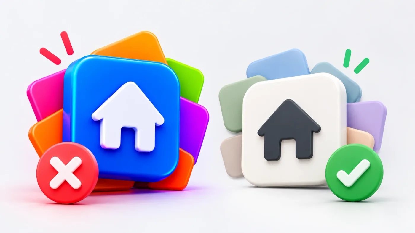
Open almost any SaaS dashboard or app settings screen and you’ll see the same icon style: a white glyph on a bright, fully saturated square. Electric blue, hot pink, lime green, all side by side.
It looks bold in a Dribbble shot. In a real product, it quietly slows people down.
After reviewing hundreds of interfaces across fintech and SaaS projects, this is one of the most common visual issues I flag, and one of the easiest to fix.
The problem with white glyphs on saturated backgrounds
An icon has one job: to be recognised quickly. Users shouldn’t have to read an icon. They should know what it means at a glance.
Highly saturated colours work against that in three ways:
Research on icon recognition points the same way: higher colour saturation can make users take longer to recognise an icon. Icons are meant to save time, so that’s a real cost.
The fix: soft backgrounds, strong glyphs
The alternative is simple: reverse where the colour intensity sits. Instead of a saturated background with a white glyph, use a soft, low-saturation tint for the background and a darker, richer shade of the same hue for the glyph.
The glyph becomes the clear focal point, the background just groups and frames it, and the overall screen feels calmer and more premium. It’s the same reason the tinted icon style has become standard in well-designed SaaS products.
How to build this into your design system
Don’t pick these colours by eye, one icon at a time. Make them tokens.
“If everything is saturated, nothing is important. Save intensity for the moments that need attention.”
When saturated colours are right
Saturation isn’t banned. It just needs a job. Use it sparingly for:
The rule I follow is simple: if everything is saturated, nothing is important.
The takeaway
Icons are small, but they show up on every screen of your product. Changing from saturated backgrounds to soft tints with strong glyphs is one of the quickest improvements you can make: faster recognition, clearer hierarchy, better accessibility, and a calmer, more premium look.
Small visual decisions add up to how a product feels. This is one worth getting right.
Want a design system that gets these details right from the start? I design fintech, SaaS and B2B products for clients across the US, UK, GCC and ANZ.
UI/UX designer with 8+ years of experience across fintech, health, and SaaS. More about me