Zippy — multi-currency digital wallet, a UX UI case study

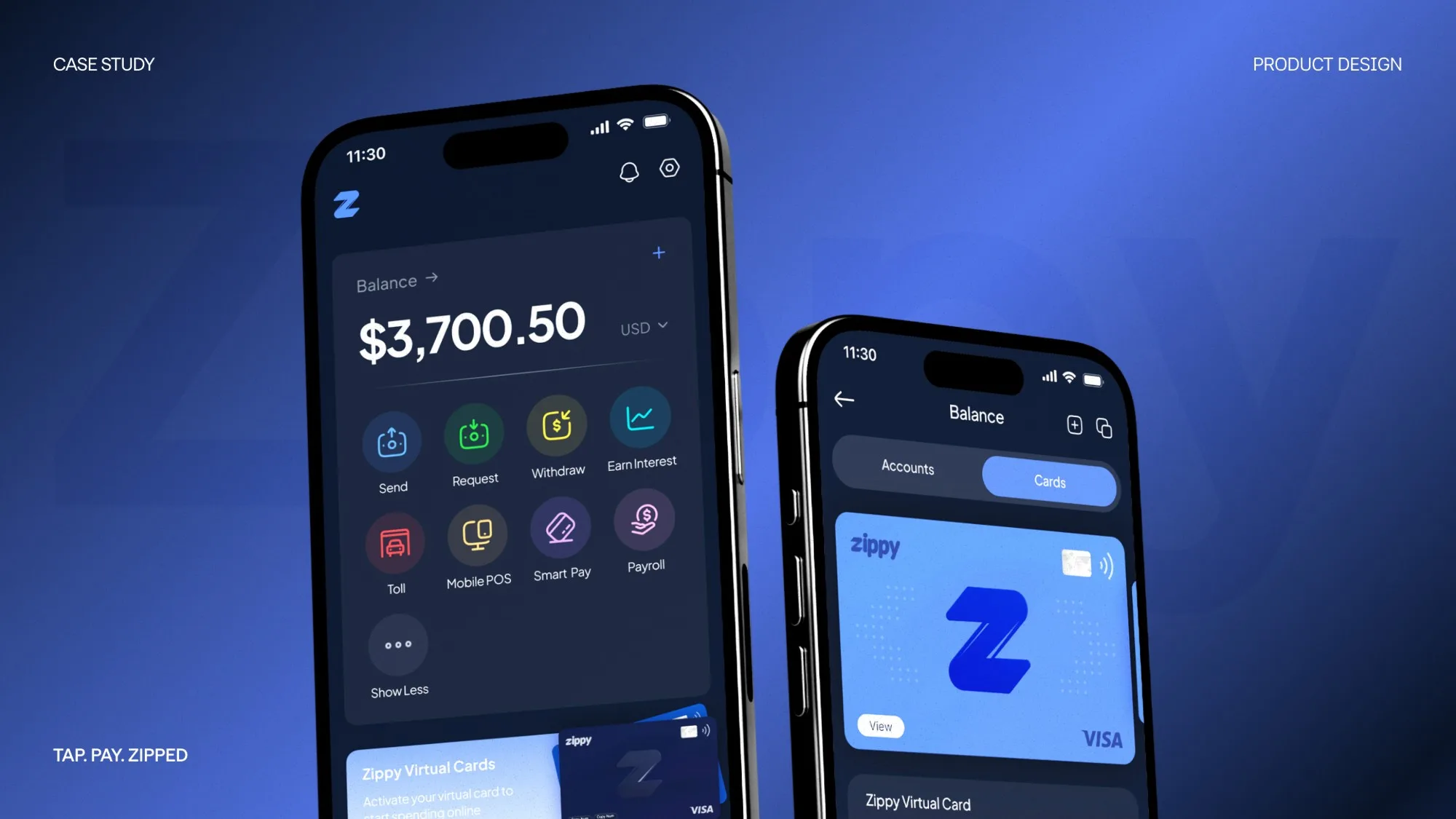
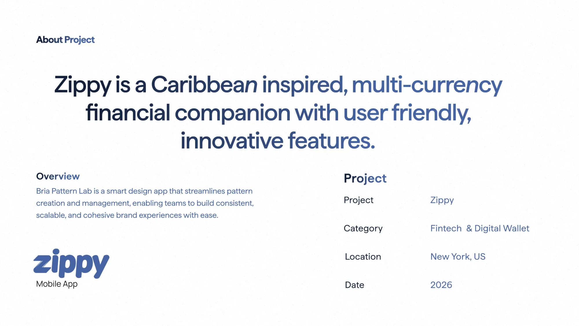
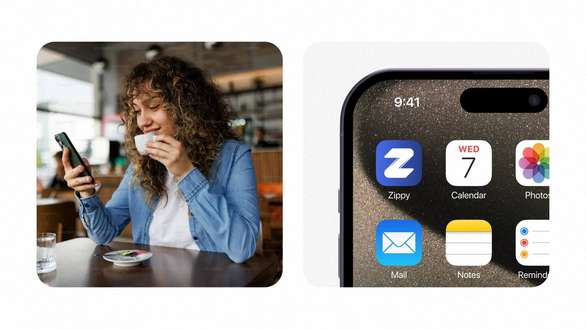
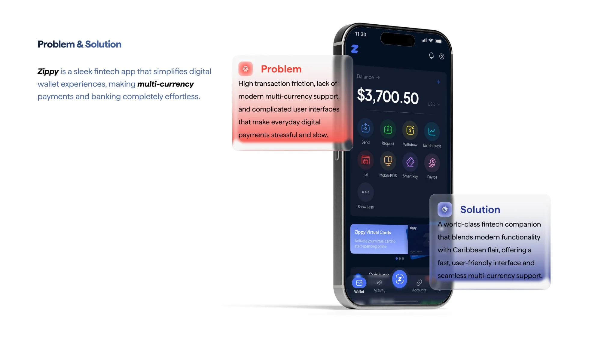
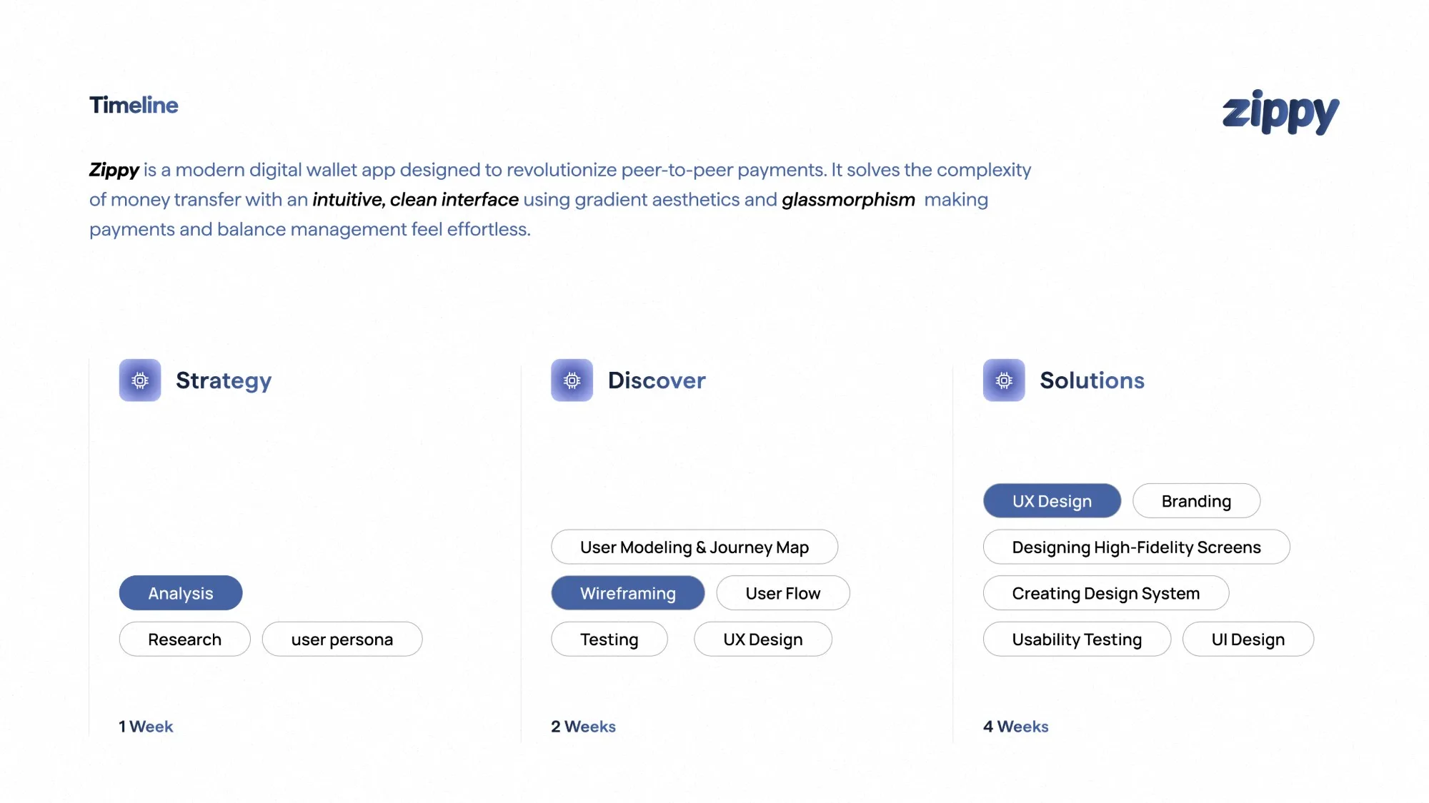
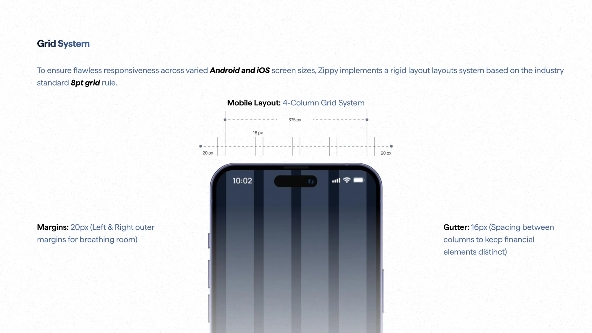
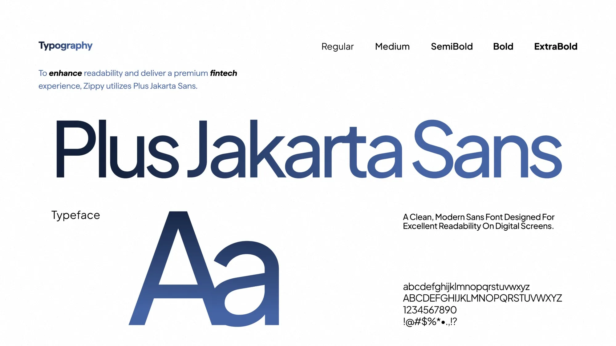
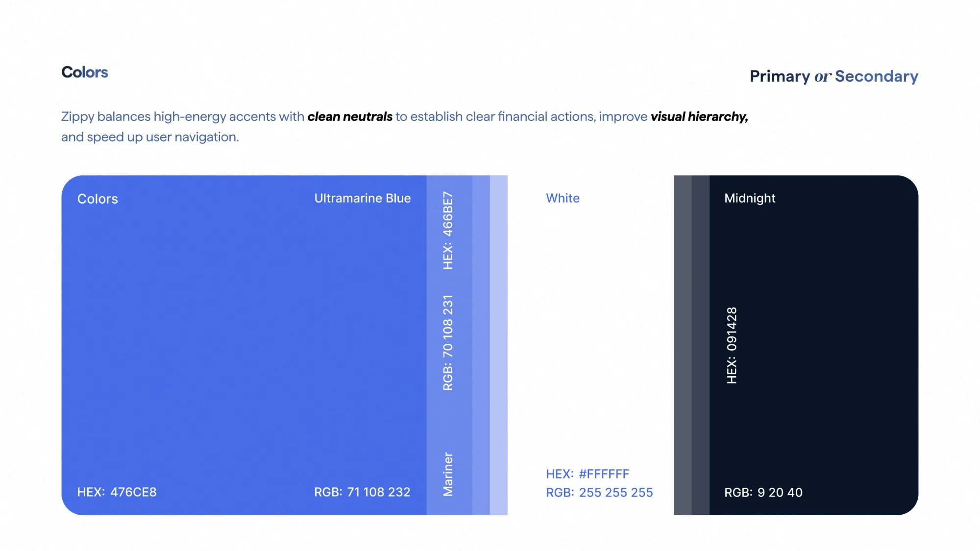
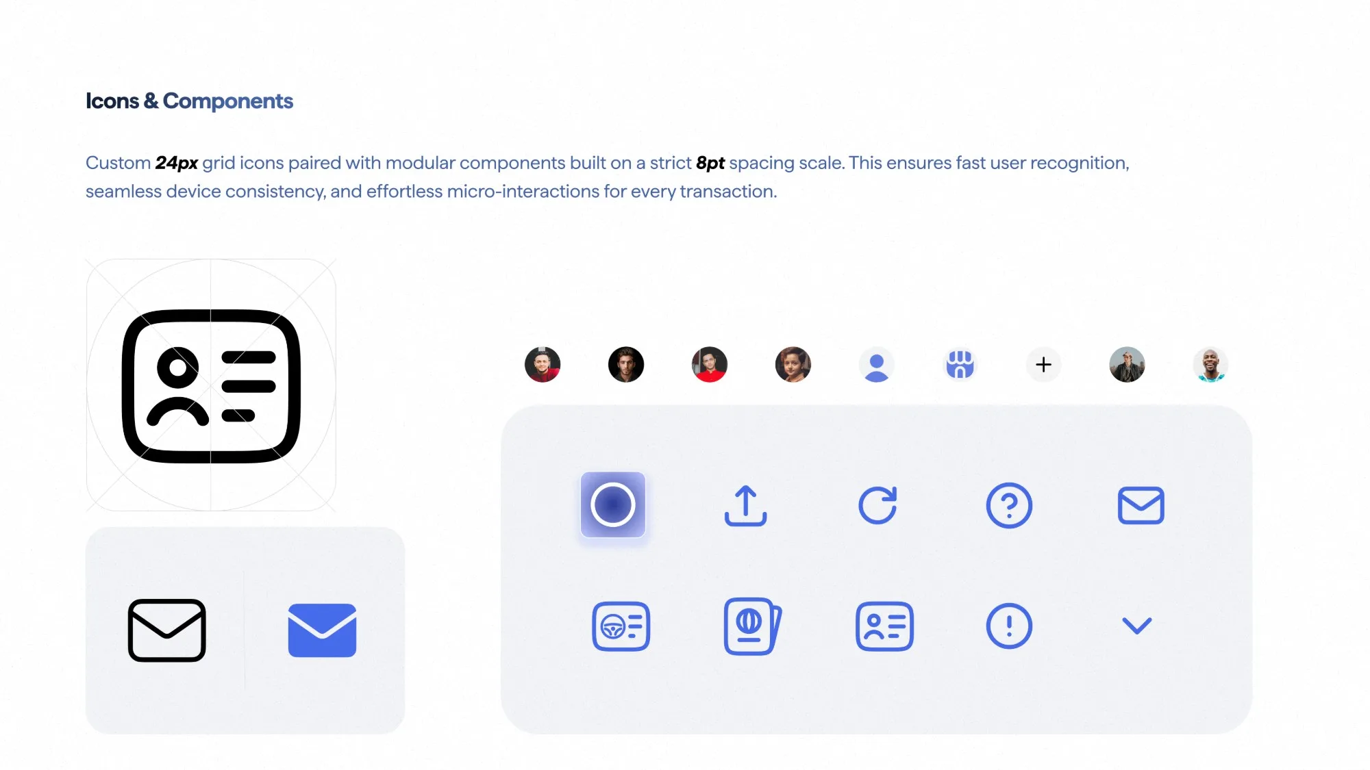
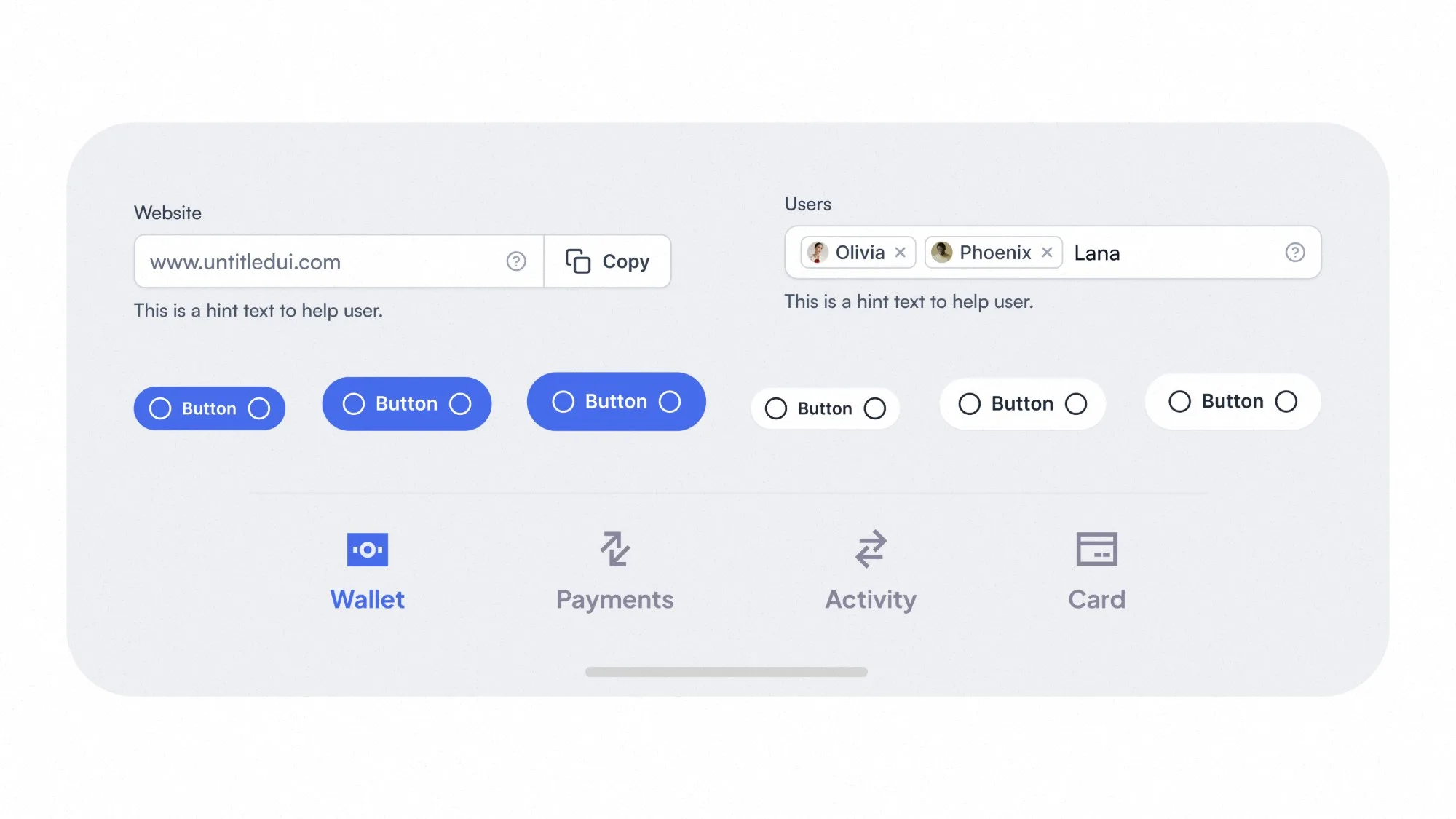
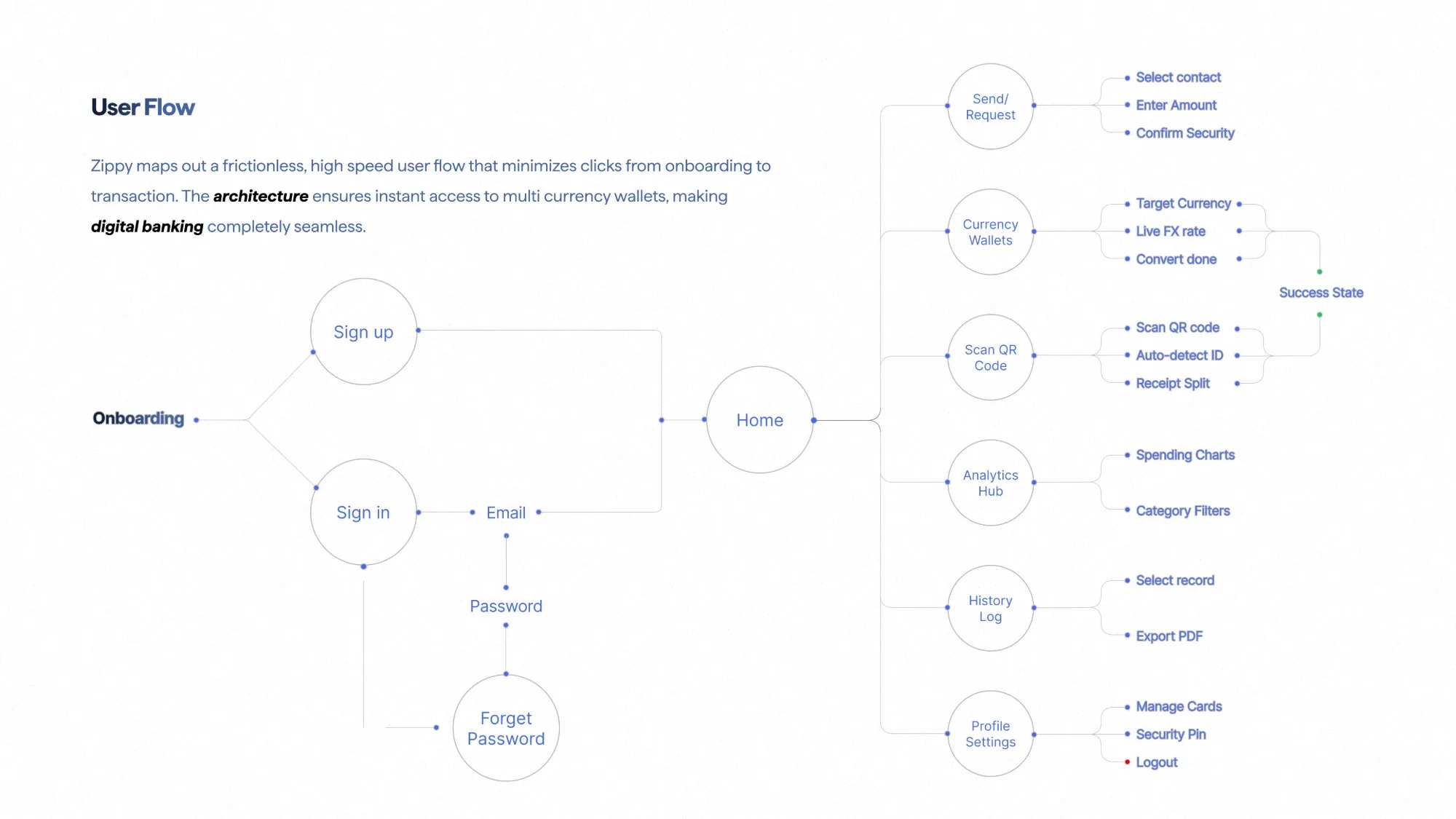
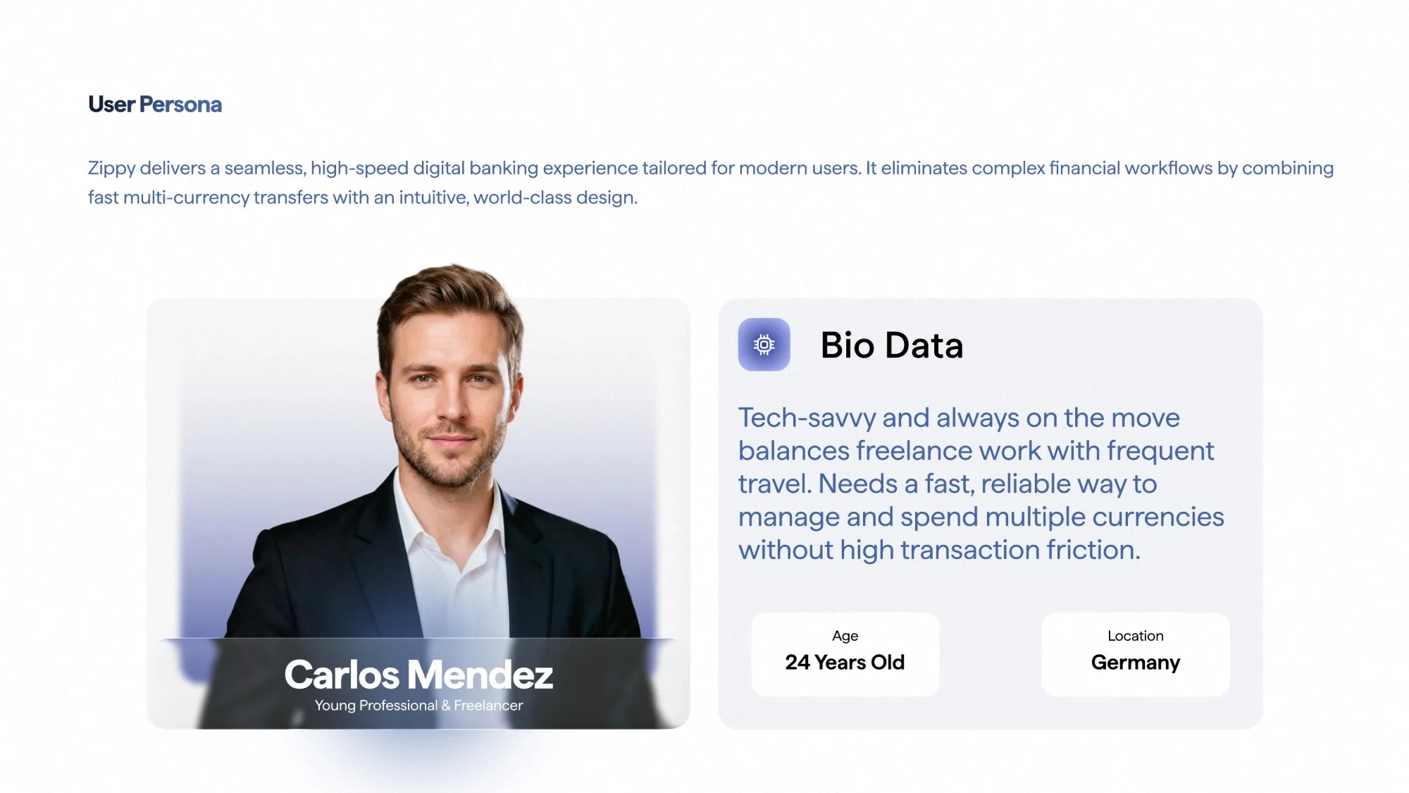
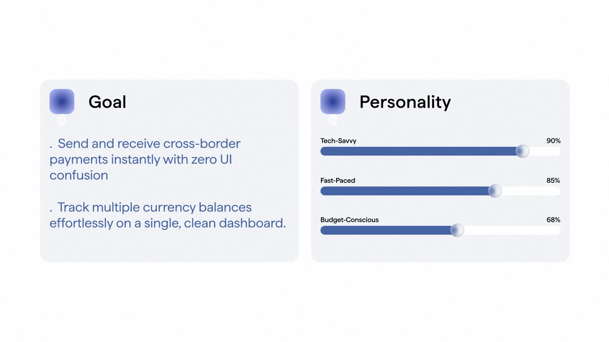
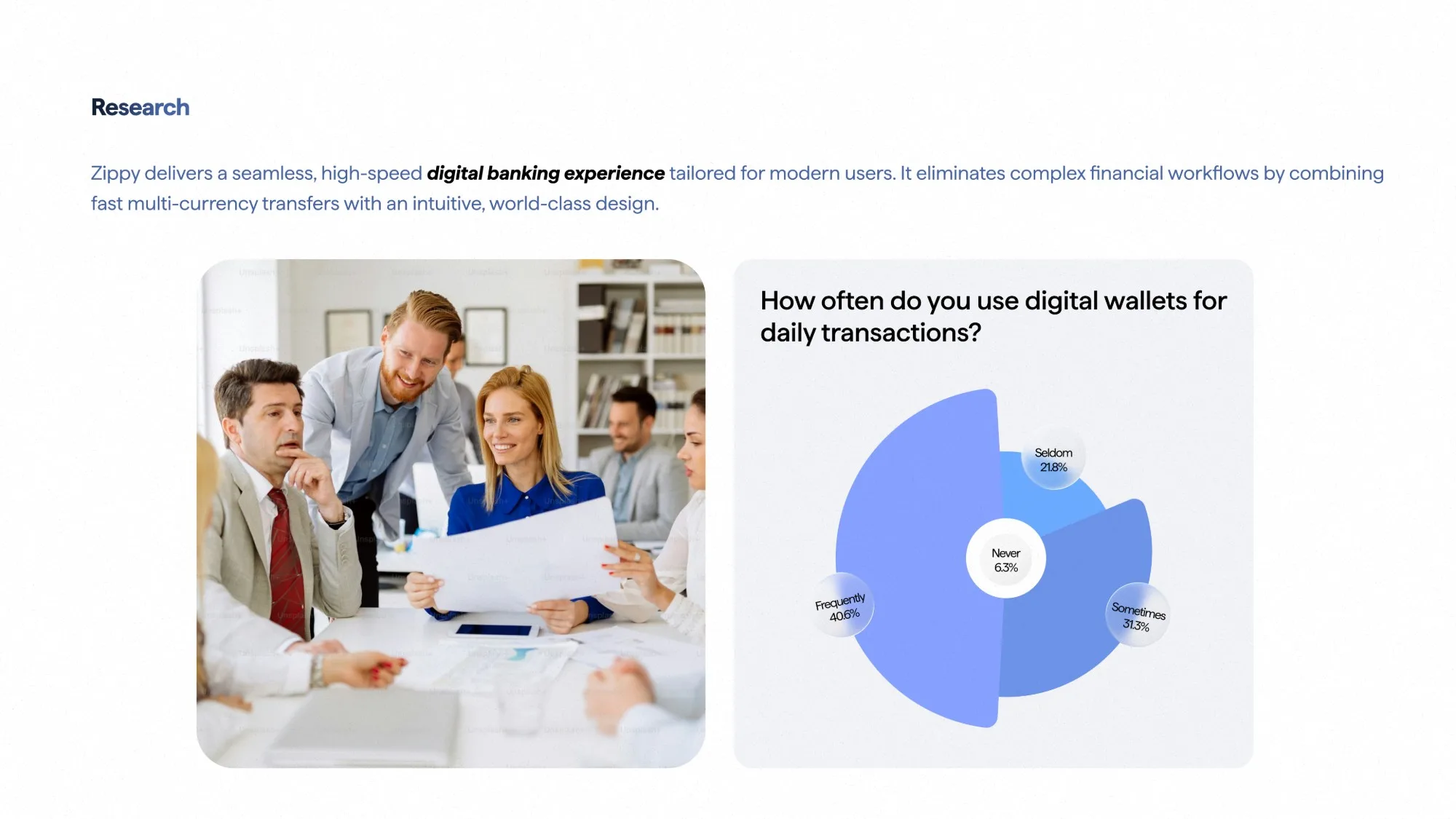
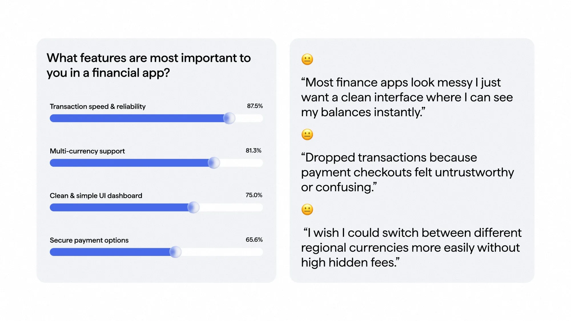
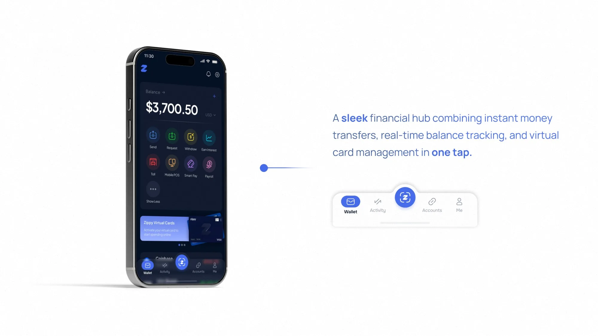
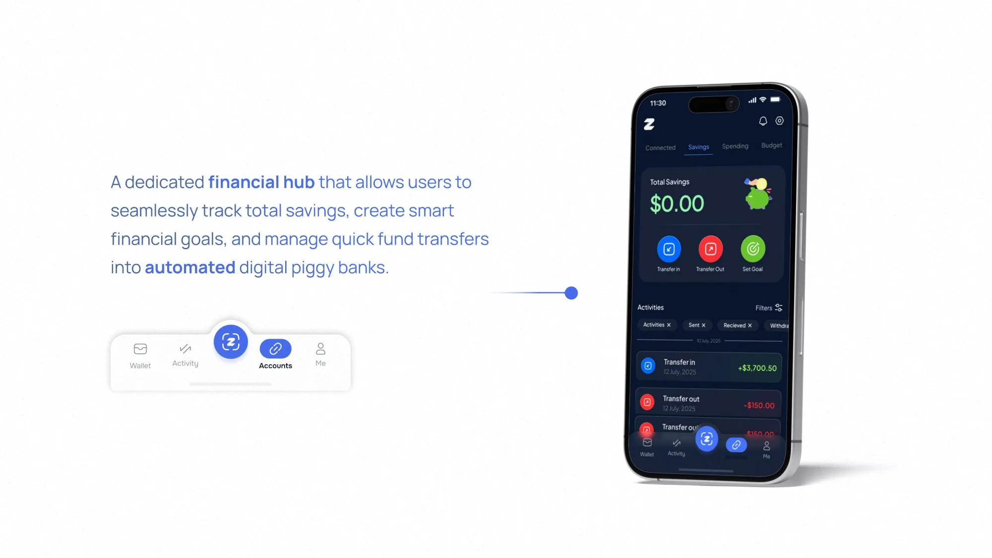
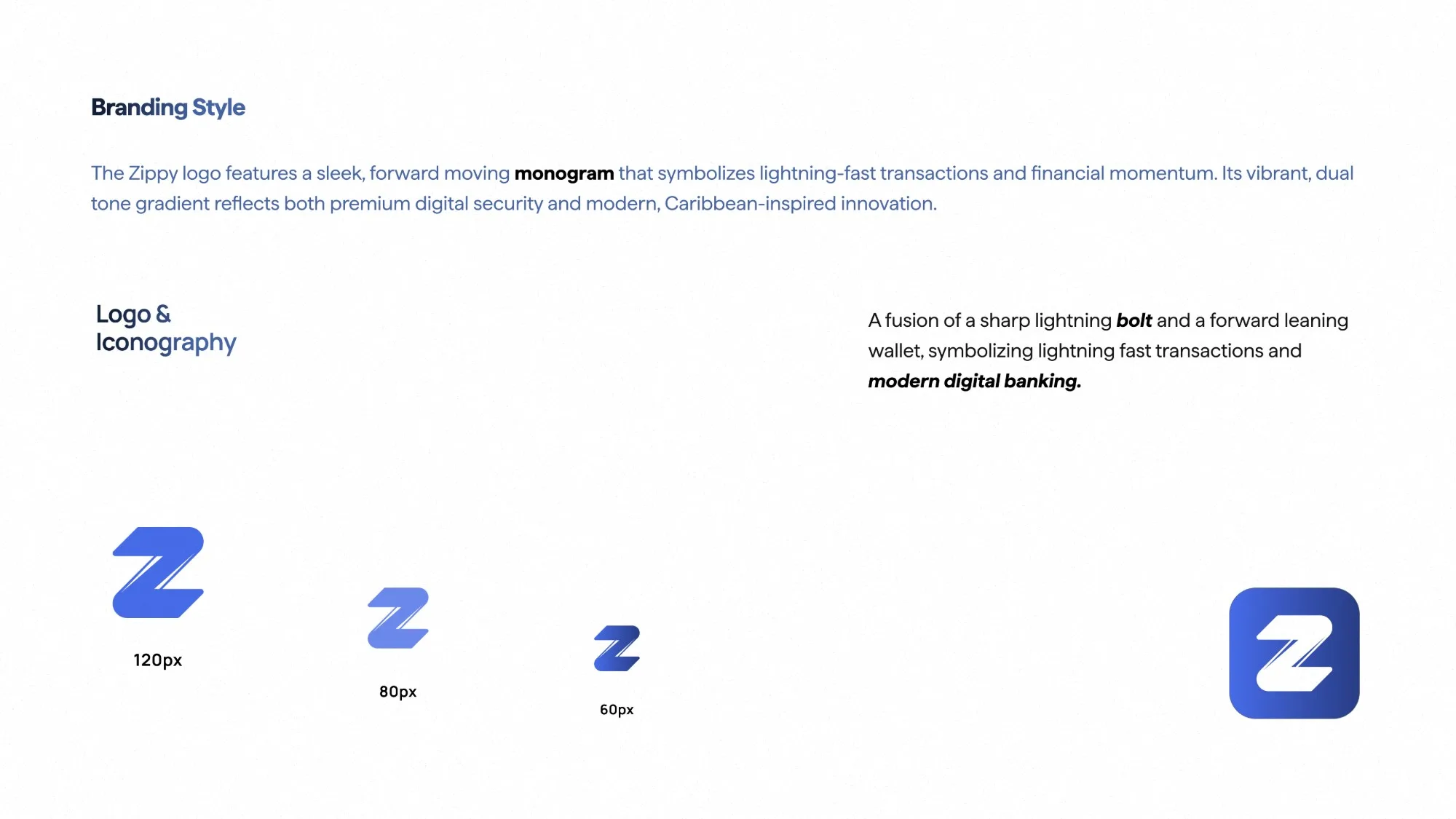
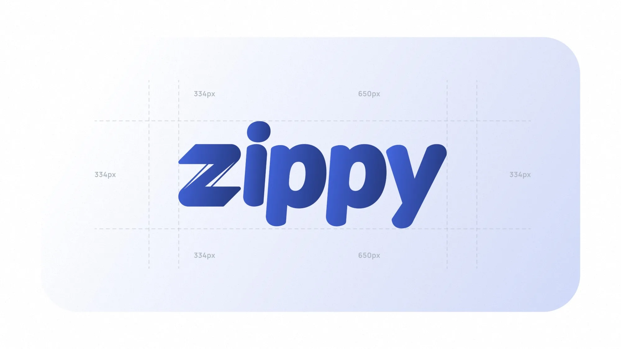
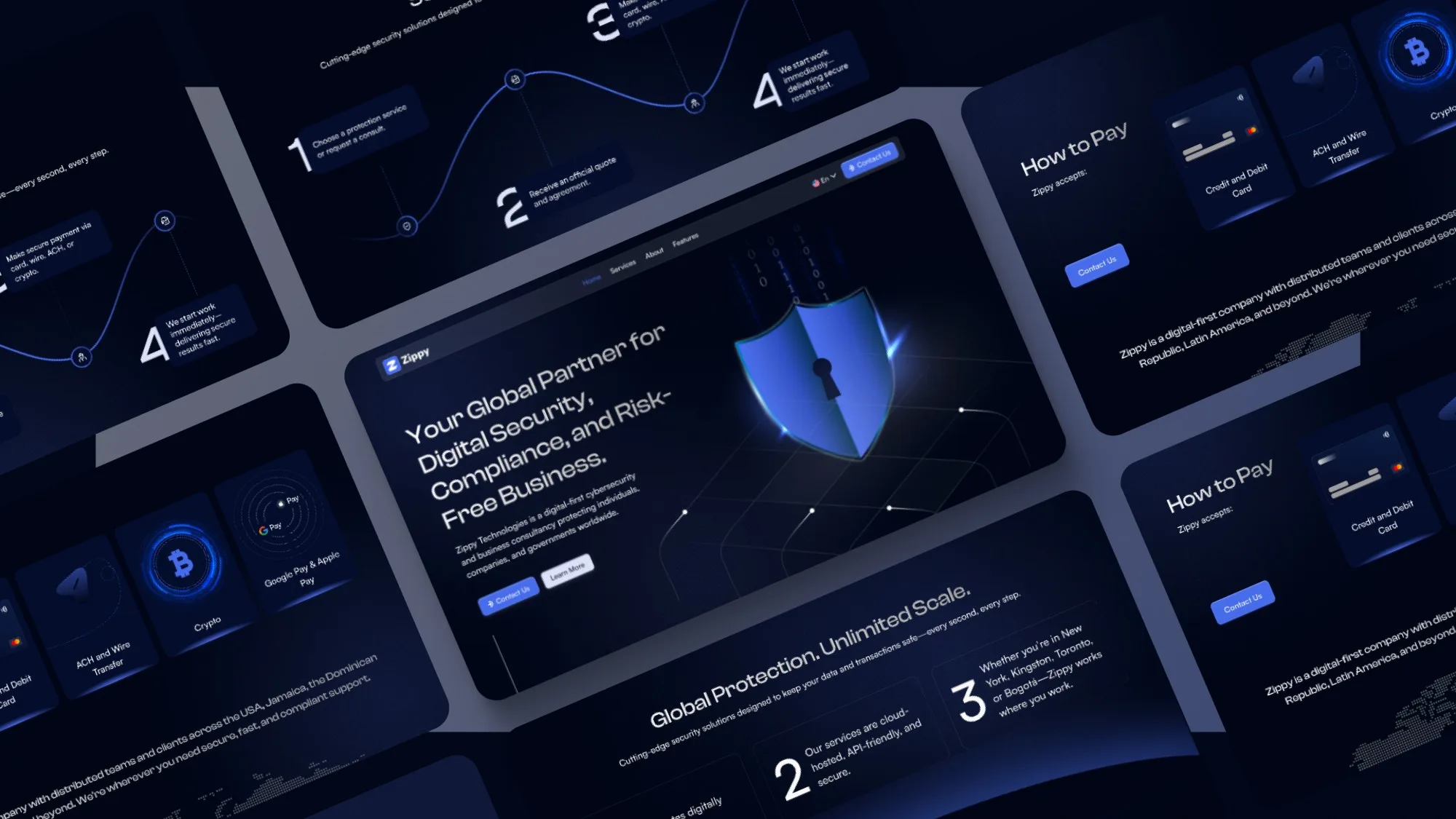
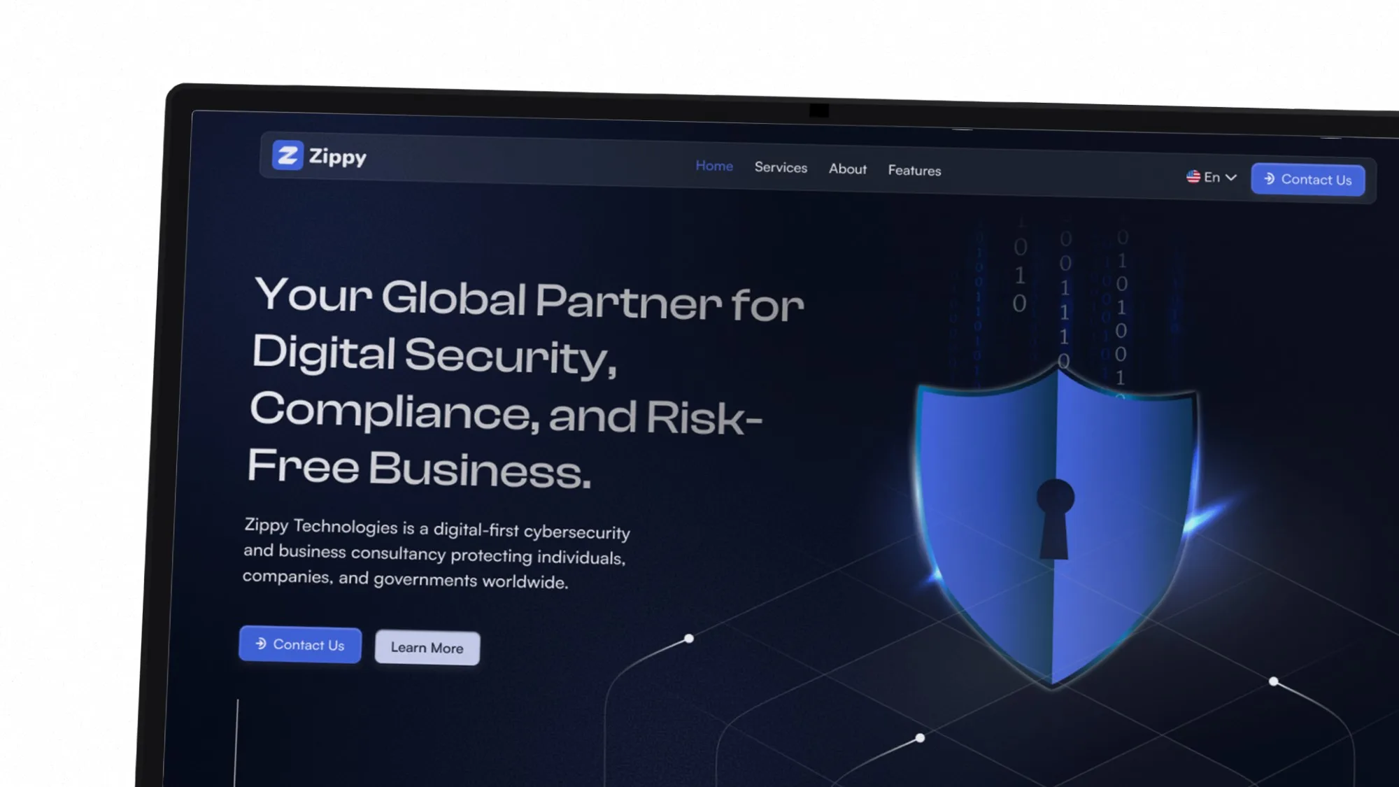
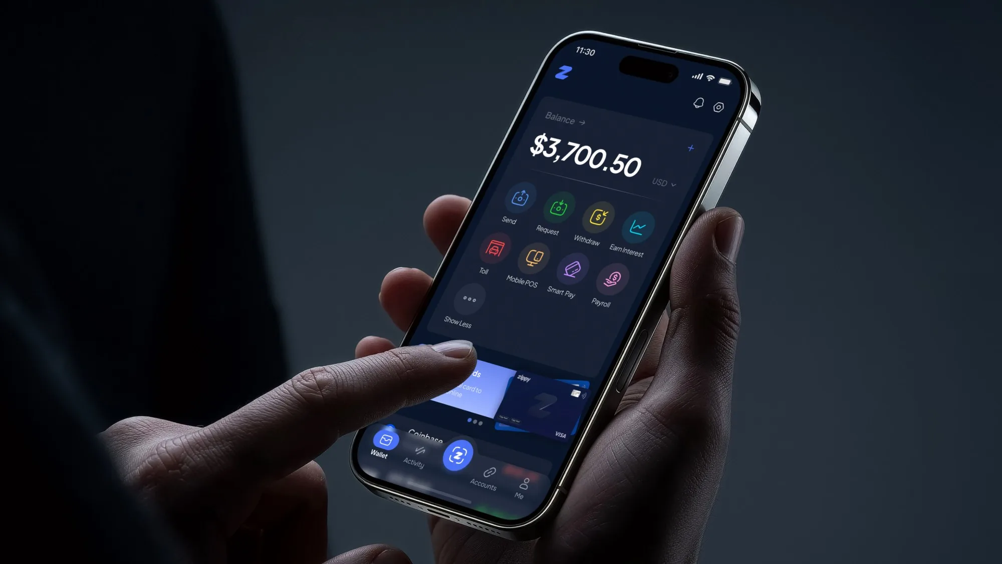
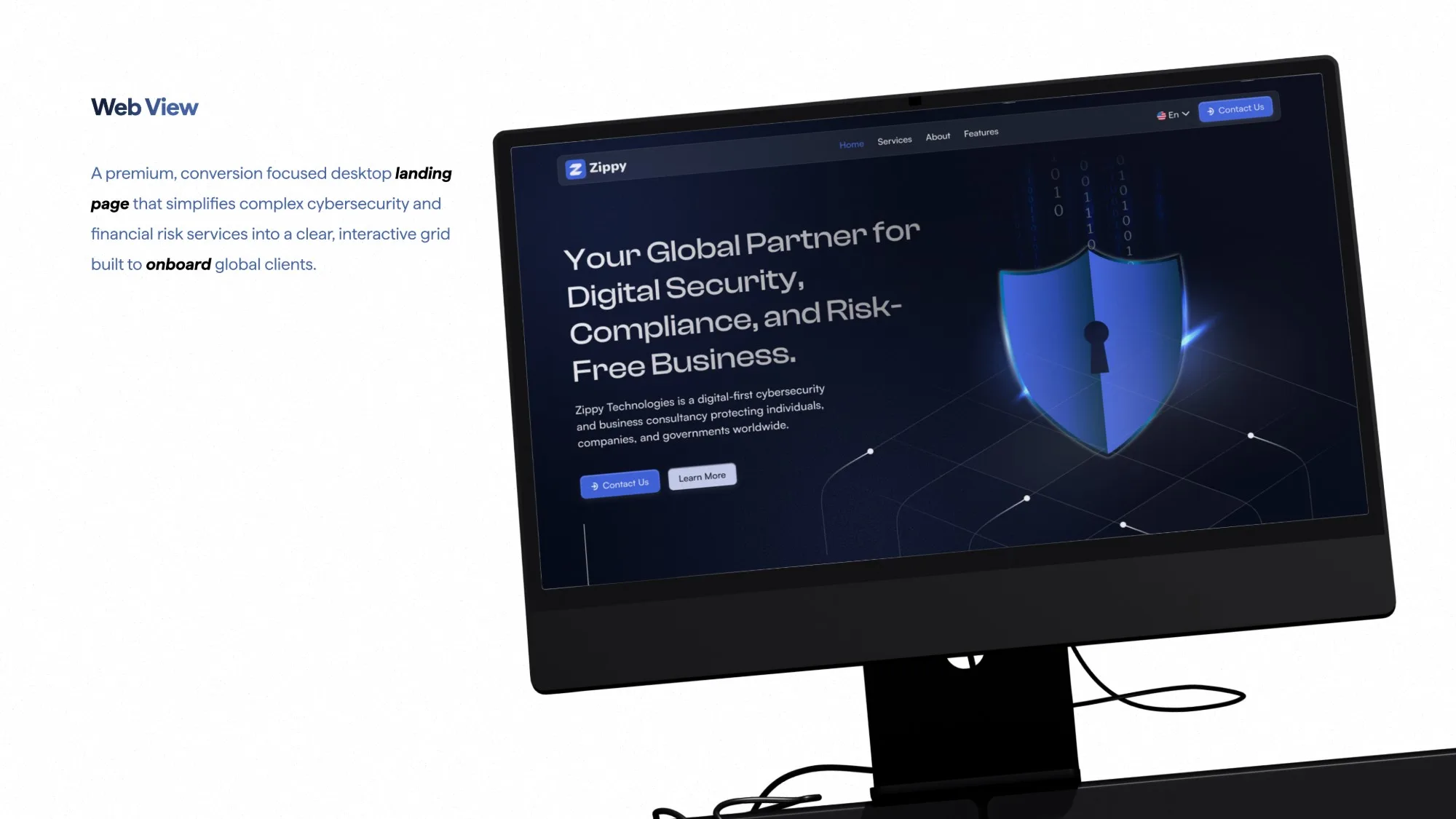
Zippy case study cover: two iPhones showing the Zippy wallet, a $3,700.50 balance with Send, Request, Withdraw, Earn Interest, Toll, Mobile POS, Smart Pay and Payroll actions, and the Zippy virtual Visa card. Tagline: Tap. Pay. Zipped. About the project: Zippy is a Caribbean-inspired, multi-currency financial companion with user-friendly, innovative features. Project: Zippy mobile app. Category: Fintech and digital wallet. Location: New York, US. Date: 2026. A woman smiling at her phone over a cup of coffee, next to a close-up of an iPhone home screen with the Zippy app icon. Problem and solution. Problem: high transaction friction, no modern multi-currency support and complicated interfaces make everyday digital payments stressful and slow. Solution: a fintech companion that blends modern functionality with Caribbean flair, with a fast, user-friendly interface and seamless multi-currency support. Timeline. Strategy, 1 week: analysis, research, user persona. Discover, 2 weeks: user modeling and journey map, wireframing, user flow, testing, UX design. Solutions, 4 weeks: UX design, branding, high-fidelity screens, design system, usability testing, UI design. Grid system: to stay responsive across Android and iOS screen sizes, Zippy uses a layout system based on the 8pt grid. Mobile layout: a 4-column grid on a 375px screen, with 20px left and right margins and 16px gutters between columns. Typography: Zippy uses Plus Jakarta Sans for readability and a premium fintech feel, in Regular, Medium, SemiBold, Bold and ExtraBold weights. A clean, modern sans font designed for excellent readability on digital screens. Colors: Zippy balances high-energy accents with clean neutrals for clear financial actions and visual hierarchy. Ultramarine Blue #476CE8 (RGB 71 108 232) with Mariner tints, White #FFFFFF, and Midnight #091428 (RGB 9 20 40). Icons and components: custom 24px grid icons paired with modular components built on a strict 8pt spacing scale, shown as an icon keyline grid, outline and filled mail icons, avatars and a set of blue line icons. Components: a website input with copy button, a users input with removable tags, primary blue and secondary white pill buttons in three sizes, and a bottom tab bar with Wallet, Payments, Activity and Card. User flow: a frictionless, high-speed flow from onboarding to transaction. Onboarding leads to sign up or sign in (email, password, forgot password), then Home. Home branches to Send/Request (select contact, enter amount, confirm security), Currency Wallets (target currency, live FX rate, convert done), Scan QR Code (scan, auto-detect ID, receipt split), both ending in a success state; Analytics Hub (spending charts, category filters); History Log (select record, export PDF); and Profile Settings (manage cards, security PIN, logout). User persona: Carlos Mendez, young professional and freelancer, 24 years old, Germany. Tech-savvy and always on the move, he balances freelance work with frequent travel and needs a fast, reliable way to manage and spend multiple currencies without high transaction friction. Persona goals: send and receive cross-border payments instantly with zero UI confusion, and track multiple currency balances effortlessly on a single, clean dashboard. Personality: tech-savvy 90%, fast-paced 85%, budget-conscious 68%. Research: a team reviewing documents in a meeting, next to survey results for the question how often do you use digital wallets for daily transactions? Frequently 40.6%, sometimes 31.3%, seldom 21.8%, never 6.3%. Research findings. Most important features in a financial app: transaction speed and reliability 87.5%, multi-currency support 81.3%, clean and simple UI dashboard 75.0%, secure payment options 65.6%. User quotes: most finance apps look messy, I just want a clean interface where I can see my balances instantly; dropped transactions because payment checkouts felt untrustworthy or confusing; I wish I could switch between different regional currencies more easily without high hidden fees. A browser window illustration with the Zippy logo, the tab title Zippy Digital Wallet and the address Zippy.com. Wallet screen: a sleek financial hub combining instant money transfers, real-time balance tracking and virtual card management in one tap. The home screen shows a $3,700.50 balance, quick actions and Zippy virtual cards, with the bottom tab bar Wallet, Activity, scan, Accounts and Me. Accounts screen: a dedicated financial hub to track total savings, create smart financial goals and move funds into automated digital piggy banks. Tabs for Connected, Savings, Spending and Budget, Transfer in, Transfer out and Set Goal actions, and a filtered activity list. Branding style: the Zippy logo is a sleek, forward-moving monogram, a fusion of a sharp lightning bolt and a forward-leaning wallet, symbolizing lightning-fast transactions and modern digital banking. Its dual-tone gradient reflects premium digital security and Caribbean-inspired innovation. Shown at 120px, 80px and 60px, plus the app icon. The zippy wordmark in a blue gradient on a construction grid showing its clear-space measurements. A collage of Zippy website sections on dark navy: the hero, a four-step process timeline, How to Pay cards for credit and debit card, ACH and wire transfer, crypto, and Google Pay and Apple Pay, and a Global Protection, Unlimited Scale section. Close-up of the Zippy website hero on a laptop: Your Global Partner for Digital Security, Compliance, and Risk-Free Business, with Contact Us and Learn More buttons beside a glowing blue shield with a keyhole. A hand holding an iPhone showing the Zippy wallet home screen with a $3,700.50 balance and quick actions. Web view: a premium, conversion-focused desktop landing page that simplifies complex cybersecurity and financial risk services into a clear, interactive grid built to onboard global clients, shown on a desktop monitor.