The challenge
Price action, instrument lists, execution controls and challenge rules all compete for attention. A useful terminal needs a stable hierarchy that keeps these decisions connected.
 TRADING EXPERIENCE
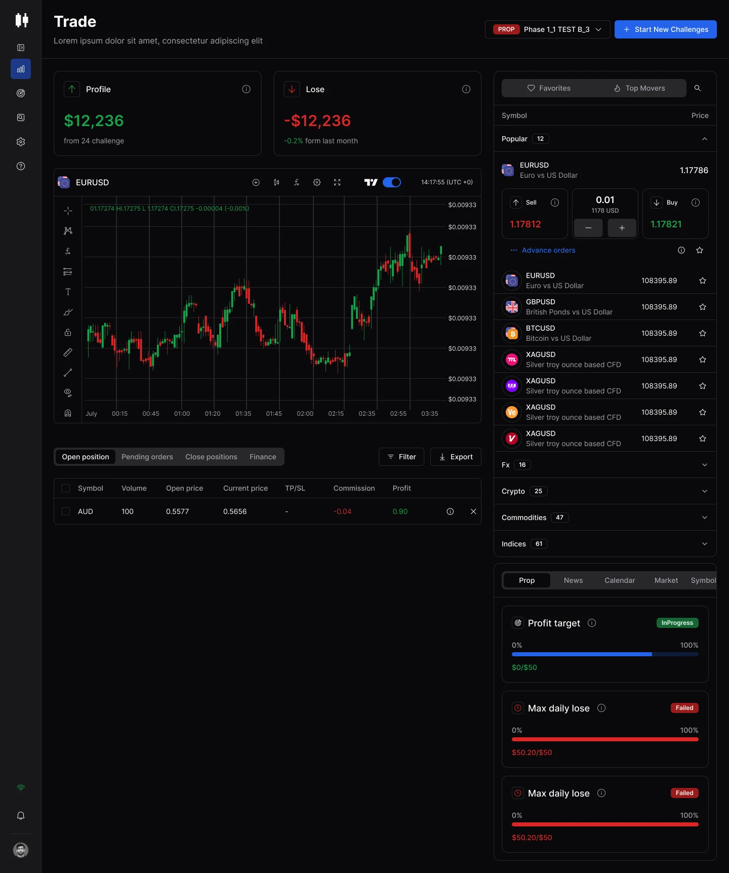

A focused desktop experience for markets, orders and account context.
EXPLORE THE STORY ↓Trade with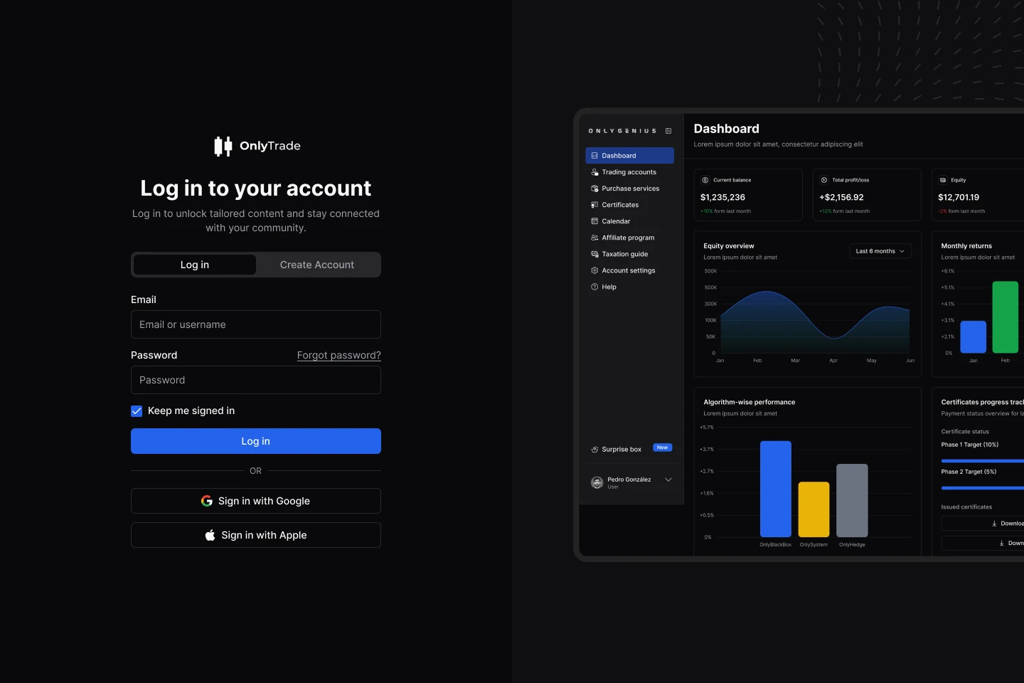
A brand application concept paired with the original account-access design.
A trading workspace brings together dense, fast-moving information. The design challenge is to help traders read the market, configure an order and stay aware of their account.
Price action, instrument lists, execution controls and challenge rules all compete for attention. A useful terminal needs a stable hierarchy that keeps these decisions connected.
Give the chart the primary canvas. Keep the market list to the side and positions below, so analysis remains the anchor of the workspace.
Group volume, margin, costs and protective settings within the order panel. Keep challenge targets and loss limits visible in a dedicated account area.
The story follows the decisions behind the interface: establish the task, organise the information, define the visual language and connect the experience.
Markets, orders and account context.
A clear centre, side rail and position area.
Candlesticks, dark surfaces and decisive blue.
Familiar access and consistent controls.
Validate discovery, orders and status comprehension.
Trading decisions,
brought into focus.
The supplied screens suggest two useful design scenarios: the active trader, who needs quick access to instruments and positions, and the challenge participant, who needs clear account context.

“Keep the instrument, the chart and my next action within the same view.”
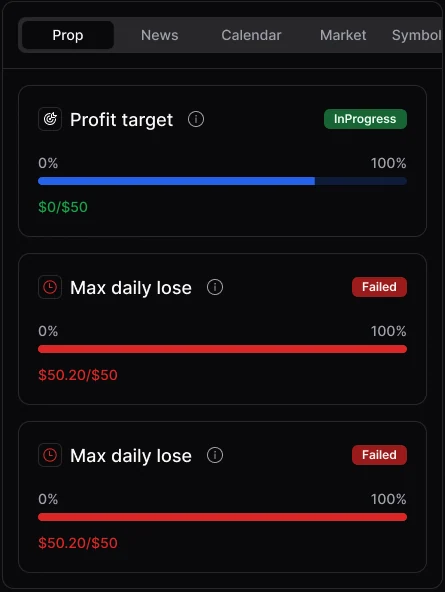
For a challenge participant, targets and loss limits are part of the daily decision. Consistent cards pair status labels with values and progress, keeping account rules close to the trading activity.
Audience scenarios and the illustrative quote are design assumptions inferred from the supplied interface. The photograph illustrates a context of use and does not depict a research participant.
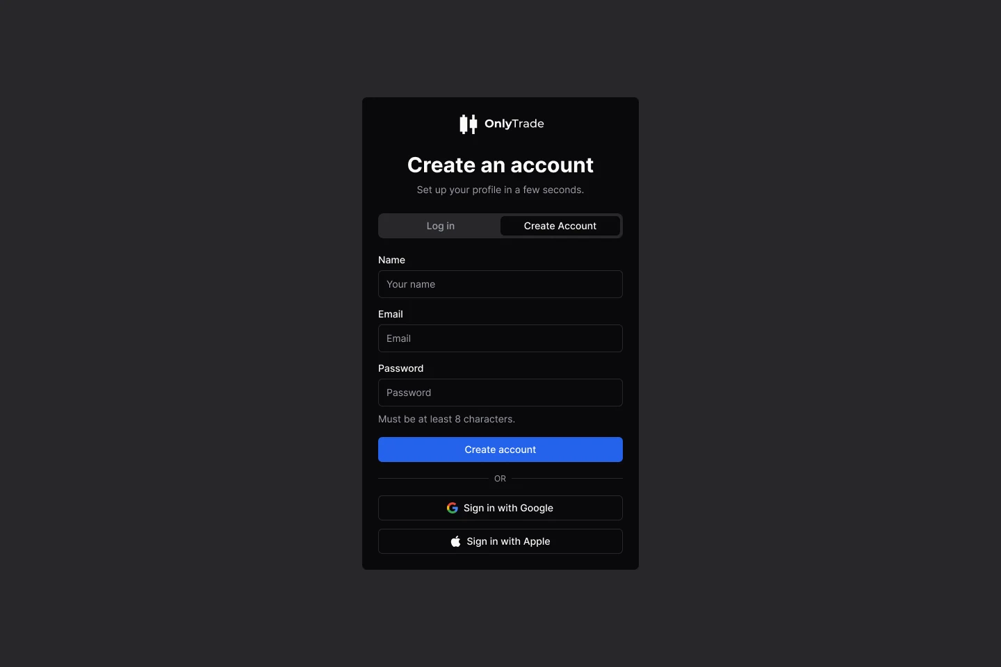
Account access introduces the same calm hierarchy as the terminal: clear labels, a deliberate primary action and a consistent identity.
The source includes a connected recovery sequence: request a reset, check email, set a password and return to sign-in.

Space to think.
Tools to stay focused.
A restrained foundation gives the data room to work. The original OnlyTrade identity, Inter typography and blue actions connect the account screens, terminal and supporting panels.
Aa Bb Cc Dd Ee Ff Gg Hh Ii Jj Kk Ll Mm
Nn Oo Pp Qq Rr Ss Tt Uu Vv Ww Xx Yy Zz
0123456789 $ € % + −
A mark built around the market.
The two candlesticks make the identity immediately recognisable within the trading environment.
Quiet foundations. Decisive blue.
Near-black surfaces support the information hierarchy. Blue gives actions and selection a consistent signal.
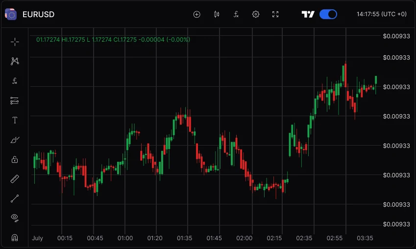
The chart anchors the main canvas. Markets and order controls sit to the right, with positions below and challenge context beside the activity.
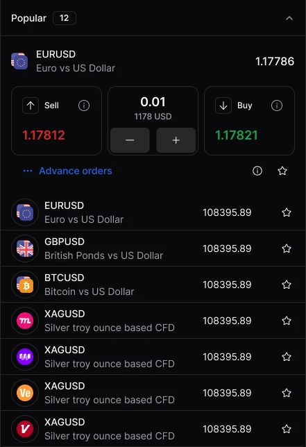
Instrument discovery, chart analysis and execution each have a clear place within the same visual language.
A real device. The original interface. A trading workspace designed to keep the important information within reach.

Analysis has a home.The central chart, instrument header and compact tools create a stable place to read price action.
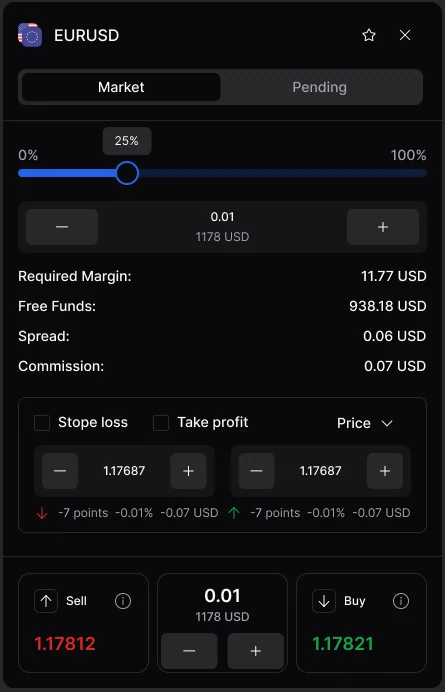
Action has context.Required margin, free funds, spread and commission appear alongside order sizing and protective controls.
Three observations connect the individual screens into a coherent design direction. Each follows a visible choice in the supplied interface.
A dominant chart, a dedicated market rail and a position area below establish a recognisable structure for the session.
Order sizing, cost information, margin and protective settings are most useful when they share the same decision space.
Values, progress bars and explicit status labels work together to make different challenge rules easier to interpret.
Test market discovery, order configuration and challenge-status comprehension with representative traders. These are design observations, not measured research findings; no live product results were supplied.
Building a trading or fintech product? I design fintech apps people trust with their money.